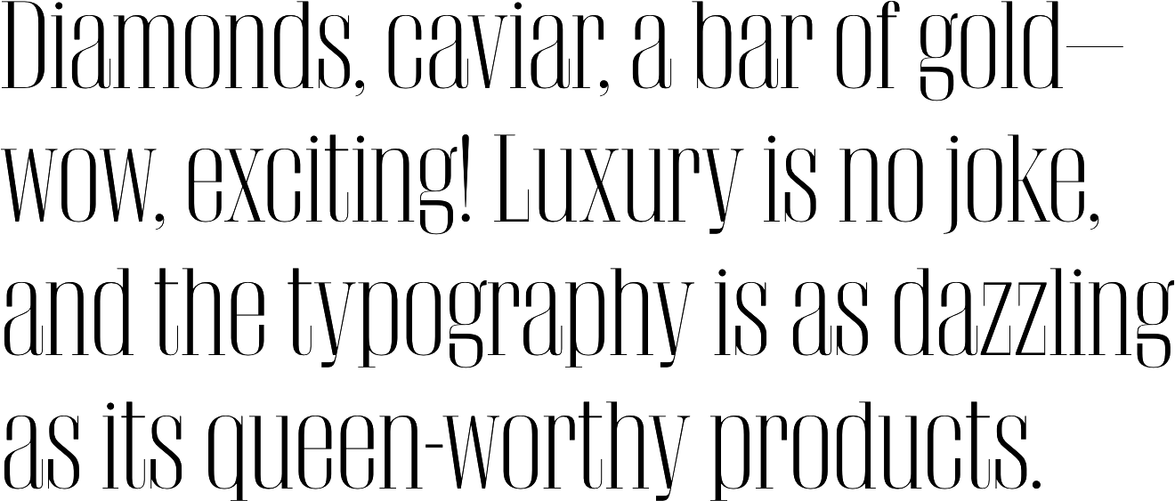
Luxe by Molly Butterfoss

Nothing says ‘I’m better than you’ better than the crisp, cool typography of a luxury ad campaign. Add some fancy to your project with some of these streamlined, glam typefaces. I humbly offer both classic and modern options to please every luxury-lover.

  • Didot by Linotype ft. Adrian Frutiger, Firmin Didot

    Specimen

    An iconic, elegant serif dating from the 1700s and slightly tweaked for modern usage.

  • Ogg by Sharp Type ft. Lucas Sharp

    Specimen

    Inspired by the hand lettering of 20th century book designer and calligrapher Oscar Ogg, Ogg captures the unique mix of calligraphic and typographic form he achieved through his use of hand carved pen nibs, brushes, and white-out. — Sharp Type

  • Giorgio by Commercial Type ft. Christian Schwartz, Panos Haratzopoulos, Ilya Ruderman, Vincent Chan

    Specimen

    Giorgio and its matching sans were designed for Chris Martinez at T, the New York Times Style Magazine, bringing runway proportions to the page in contrasting ways. — Commercial Type

  • Le Jeune Poster by Commercial Type ft. Christian Schwartz, Paul Barnes, Greg Gazdowicz

    Specimen

    Le Jeune, designed by Commercial Type partners Paul Barnes and Christian Schwartz for Chris Dixon’s refresh of Vanity Fair, is a modern adapation of the French Modern (Didot) idiom. Where the French Moderns typically feature soft teardrop forms, Le Jeune features sharp, round ball terminals more typical of British and American Moderns. — Commercial Type

  • Kessler by Production Type ft. Alaric Garnier

    Specimen

    Kessler finds its own peculiar voice with this “slab-but-not-so-much”. Sturdy and clear at the same time: that’s the tension achieved by Garnier, who devised shapes that are both delicate and resilient. — Production Type

  • David by A is for Apple

    Specimen

    David is a sans-serif typeface designed by Émilie Rigaud and published through A is for Apple in 2014. It’s named after Michelangelo’s David and features wide proportions and true italics rather than obliques. The family is available in six weights with matching italics. -Typewolf

  • Semplicità by Canada Type ft. Alessandro Butti, Patrick Griffin, Bill Troop

    Specimen

    Designed by Alessandro Butti in the 1930s, Semplicità was the foundation for the redesign of the Céline logo—which might help make up for the dark fact that it's also known for being the most popular sans serif in Italy during the Fascist era. It feels a little too Deco to be in style today, but everything is cyclical, so keep it around and see.